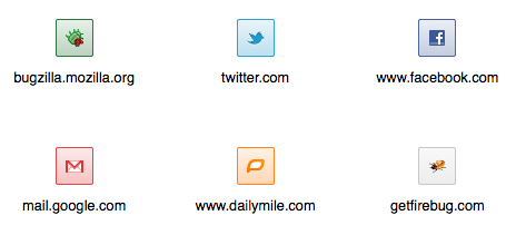
Dominant Favicon Color
Most websites only provide a 16x16px favicon, but what can we do if we want a larger icon to represent a site? Faaborg had an idea to use the dominant color of this favicon to color the background of a box surrounding the icon. Yesterday I used the canvas API to prototype this idea for a new tab page, and it turned out pretty well!

I generalized my dominant color function a bit and posted it in a gist, in case anyone else might find it useful! You can also grab the latest UX branch nightly build if you want to see this new tab page prototype in action.
Update: Mardak wrote a neat restartless add-on that lets you test this algorithm (or any variation you come up with) on images on the web.